

A Blogger template consists of XHTML and blogger elements. To design a basic layout of the template, you will use namespaces. A namespace (xmlns) is pre-defined to use with the Blogger by Google. 3 types of namespaces are basically used as follows
- xmlns:b – ‘b’ specifies that this namespace is used to access the blogger elements.
- xmlns:data – It is used to specify that from where the data of the blog comes.
- xmlns:expr – Calculates the expression for attributes.
You will write all the code in main.xmlfile of Blogger.
We'll start with creating a raw skeleton of the template. It'll help us in understanding the structure and layout of the template —in an easy way.
Use your favorite code editor to create this template. Let's start with the following minimal structure using blogspot editor .
Use your favorite code editor to create this template. Let's start with the following minimal structure using blogspot editor .
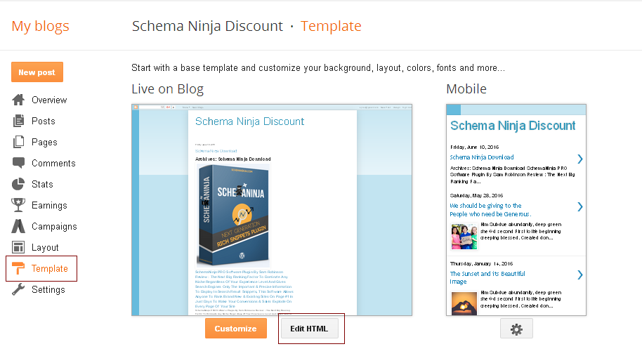
- First of all, login to your blogger dashboard.
- Now create a demo blog. If you have already demo blog then skip this.
- Now open that demo blog dashboard.
- Navigate Template >> Edit HTML.
- avigate Template >> Edit HTML.
 Next, you will see blogger template editior.
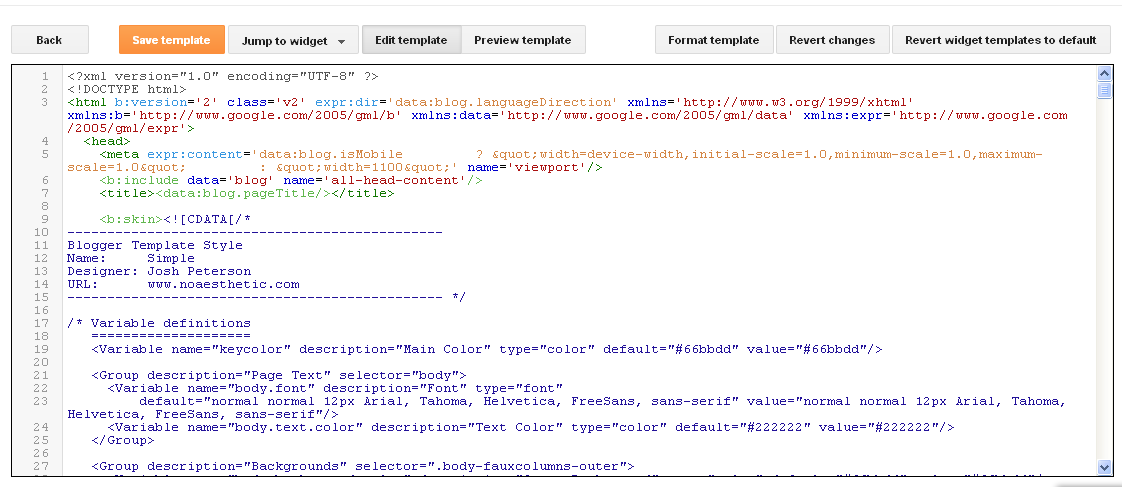
Above all steps are easy and you may know already. Main part of creating blogger template is start from here.
Step#1
You are in blogger template editior. Select all codes and delete them. And click save. Is you saved.
It will show error like “Error parsing XML, line 1, column 1: Premature end of file”
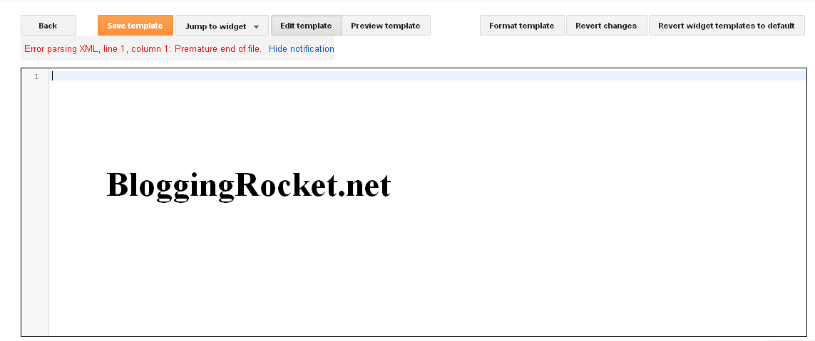
Blogger support xml language. so first declare xml
Copy these codes and paste to text editior.
<?xml version="1.0" encoding="UTF-8" ?>
<!DOCTYPE html>
<html lang='en-US' b:version='2' class='v2' xmlns='http://www.w3.org/1999/xhtml' xmlns:b='http://www.google.com/2005/gml/b' xmlns:data='http://www.google.com/2005/gml/data' xmlns:expr='http://www.google.com/2005/gml/expr' xmlns:og='http://ogp.me/ns#'>
   <head>
  </head>
</html>
Step#2
Now try to save. You will see anothet error like “There should be one and only one skin in the template, and we found:”
Step# 3
Now add skin tag in editor. Copy paste below below <head>
<![CDATA[
/* Custom CSS rules goes here... */
]]>
</b:skin>
In skin tag our template css will written. I will explain this in next part. Now save template. You still seeing an error saying “The template must include a “<body>” tag”
Step# 4
Here we need to add body tag to blog template. Just add below codes after </head>
<body>
</body>
</body>
Now try to save template. A new error like We did not find any section in your template. A template must have at least one b:section tag.
Step#5
Here we need to add b:section tag. Copy below codes and paste after <body>
<b:section class='header-right' id='header-right' maxwidgets='1' showaddelement='yes'
</b:section>
</b:section>
Now save template. Saved ?
Yes you have created a white page template. In simple, complete template is here.
<?xml version='1.0' encoding='UTF-8' ?>
<!DOCTYPE html>
<html b:version='2' class='v2' expr:dir='data:blog.languageDirection' xmlns='https://www.w3.org/1999/xhtml' xmlns:b='https://www.google.com/2005/gml/b' xmlns:data='https://www.google.com/2005/gml/data' xmlns:expr='https://www.google.com/2005/gml/expr'>

<head>
 <b:skin>
  <![CDATA[
   /* Custom CSS rules goes here... */
  ]]>
 </b:skin>
</head>
<body>
 <b:section class='header-right' id='header-right' maxwidgets='1' showaddelement='yes'>
 </b:section>
</body>

</html>
You can Use your favorite code editor asides blogspot editor to create this template. To proceed, Read the illustration and examples below in full details as we analyze blogger template in full
<?xml version="1.0" encoding="UTF-8" ?>
<!DOCTYPE html>
<html lang='en-US' b:version='2' class='v2' xmlns='http://www.w3.org/1999/xhtml' xmlns:b='http://www.google.com/2005/gml/b' xmlns:data='http://www.google.com/2005/gml/data' xmlns:expr='http://www.google.com/2005/gml/expr' xmlns:og='http://ogp.me/ns#'>
<head>

</head>
<body>

</body>
</html>
The very first line of the template declares it as an XML document. It's essential so that web browsers can parse and process the template code in a correct manner.
The next line
<!DOCTYPE html> specifies that we're going to use HTML5 code within our XML document. Once again, it helps web browsers process the template code in an efficient manner.The attributes added to the
<html> tag declares the XML namespace for the document. It also has the language attribute for the document. If you're coding your template in a language other than English, change the language code.The blank
<head> tag section is where the web page's metadata will go. It includes various meta tags, CSS styles and scripts. We also have a blank <body> section where the design and layout will be coded.Let's move on to the next step and add the basic and essential metadata to the
<head> section.
<head>
    <b:include data='blog' name='all-head-content' />
    <title><data:blog.pageTitle/></title>
    <meta content='width=device-width, initial-scale=1' name='viewport' />
    <b:skin>
      <![CDATA[
        /* Custom CSS rules goes here... */
      ]]>
    </b:skin>
</head>
The very first
<b:include> tag adds some of the most important SEO tags within this section. It includes an all-important page description tag too.The next one is quite obvious and easy-to-understand. The
<title> tag adds the page title to the head section. All these tags are important for search engines and crawlers.The
<meta> tag having the attribute name='viewport' is added to activate the responsive design mode so that the layout renders—nicely—on smaller devices too.The
<b:skin> tag includes all the CSS code to create both the layout and design of the blog. At present, it is empty and will be populated with the relevant CSS rules—at a later stage.Now, let's move on to the
<body> section and see all the important elements within it.
The
<body> section encapsulates all the elements—visible—to the site visitors within the web browser. You're free to add your preferred layout within this section.Let's start with the
<header> section. It's different from the head section that contains the document's metadata.
<header>
  <b:section class='header' id='header' maxwidgets='1' showaddelement='no'>
    <b:widget id='Header1' locked='true' title='' type='Header'></b:widget>
  </b:section>
</header>
The
<header> section includes the blog's title and description. One can also replace them with a custom logo. You may notice a <b:section> tag. That's how we create different types of sections within a Blogger template.Within this section, we've created a
<b:widget> having an attribute type='Header' which includes all the functionality of a typical Blogger template header.Next one is the primary blog posts section where all the written articles appear on the page. Here's how to create this section.
<b:section class='main' id='main' showaddelement='yes'>
  <b:widget id='Blog1' locked='true' title='Blog Posts Section' type='Blog' />
</b:section>
You can note that we've added the
type='Blog' attribute to the <b:widget> tag. It's a predefined attribute that automatically adds all the required functionality for this specific section.It automatically generates the required content for the homepage, archive page, search page, and of course for the single post page.
Additional widgets can be added to this section because we've added the
showaddelement='yes' attribute to the <b:section> tag. Bloggers often use this feature to add custom content either at the top or bottom of the post.The next important section is the sidebar that'll appear on the right side of the primary content.
<aside>
  <b:section class='sidebar' id='sidebar' maxwidgets='' showaddelement='yes'>
  </b:section>
</aside>
We've used the HTML5
<aside> tag for the sidebar. Though it is not mandatory to use it and can be easily replaced with a regular <div> tag, I'd highly recommend using it for this section.You may notice that the sidebar section doesn't contain any widget. So, basically, we've created an empty sidebar which can be populated with the desired widgets through the dashboard interface.
And, last but not least is our footer section. Here's the code snippet.
<footer>
  <div>
    Copyright © 2019 <strong><data:blog.title/></strong>
  </div>
</footer>
It's a simple footer section consisting of a copyright declaration. Note the use of HTML5
<footer> tag for this one. The blog name is written—dynamically—after the copyright statement.One can create a multi-column and widget-enabled footer section too. The complexity or flexibility of the layout entirely depends on your needs and on your technical skills.
So, here's how the entire template code looks like—at this stage.
<?xml version="1.0" encoding="UTF-8" ?>
    <!DOCTYPE html>
    <html lang='en-US' xmlns='http://www.w3.org/1999/xhtml' xmlns:b='http://www.google.com/2005/gml/b' xmlns:data='http://www.google.com/2005/gml/data' xmlns:expr='http://www.google.com/2005/gml/expr' xmlns:og='http://ogp.me/ns#'>
    <head>
        <b:include data='blog' name='all-head-content' />
        <title>
            <data:blog.pageTitle/>
        </title>
        <meta content='width=device-width, initial-scale=1' name='viewport' />
        <b:skin>
            <![CDATA[
            /* Custom CSS code goes here... */
            ]]>
        </b:skin>
    </head>
    <body>
        <div id="blog-wrapper">
            <header>
                <b:section class='header' id='header' maxwidgets='1' showaddelement='no'>
                    <b:widget id='Header1' locked='true' title='' type='Header'></b:widget>
                </b:section>
            </header>
            <div id="content-wrapper">
                <div class="content-table">
                    <div class="content-row">
                        <b:section class='main column' id='main' showaddelement='yes'>
                            <b:widget id='Blog1' locked='true' title='Blog Posts Section' type='Blog' />
                        </b:section>
                        <aside class="column">
                            <b:section class='sidebar' id='sidebar' maxwidgets='' showaddelement='yes'>
                            </b:section>
                        </aside>
                    <div>
                </div>
            </div>
            <footer>
                <div>
                    Copyright © 2019 <strong><data:blog.title/></strong>
                </div>
            </footer>
         </div>
    </body>
    </html>
First of all, I've enclosed the content of the body section within a
<div> tag. It's a wrapper for the entire blog structure.You may note that I've encapsulated both the posts content section and the sidebar inside 3
<div> tags. Each of these tags have been assigned some CSS classes and ids.You may also note that a CSS class
.column has been added to both the posts and sidebar section. All these new additions are used to properly create our blog's core layout structure with the help of custom CSS rules.Before we move ahead to style our layout through CSS rules, let's take a look at the mockup to get a fair idea about it. It'll be a classic two-column layout generally used for the blogs.

All the custom CSS rules will be written between the
<b:skin> tags as shown below. I've given a general overview (see below) about the order in which these CSS rules will appear.
<b:skin>
  <![CDATA[
  /*
    1. CSS Reset
    2. Core Layout Structure
    3. Template Design
    4. Utility Classes
    5. Media Queries
  */
  ]]>
</b:skin>
Instead of presenting the entire CSS code—which is quite long—I've included the CSS rules for the core layout structure. Take a look!
/* Template's Core Layout */
 #blog-wrapper {
     width: 1024px;
     margin: 0 auto;
}
 #content-wrapper {
     width: 100%;
     height: 100%;
     overflow: hidden;
}
 .content-table {
     display: table;
     border-collapse: separate;
}
 .content-row {
     display: table-row;
}
 #main {
     padding: 25px 25px 25px 20px;
     width: auto;
     height: 100%;
     display: table-cell;
}
 aside {
     width: 32%;
     height: 100%;
     border-left: 1px solid #ddd;
     padding: 25px;
     display: table-cell;
}
 footer {
     width: 100%;
     clear: both;
     border-top: 1px solid #ddd;
     padding: 20px;
}


No comments:
Post a Comment